The corporate slogan of RaQualia has been “innovators for life”, and we have embraced the culture of pursuing science to create new medicines since our founding in 2008. We strive to brighten people’s future as “innovators”, who create significant values from a blank canvas. We follow the new “Mission, Vision and Values” to unlock innovation and pursue sciences to bring better “life” to patients and all people around patients.
The “Mission, Vision and Values” express our philosophy to deliver new medications to those suffering from diseases where no effective treatment options exist or existing treatment methods are insufficient. Guided by this philosophy, we, as professionals in drug discovery, are focusing on research and development efforts with a primary focus on patients. We pursue our science to create innovative first-in-class therapeutic medications.
Mission
We brighten people’s lives through the power of innovation
Vision
Becoming the world’s leading innovators
who deliver advanced medicines to patients with intractable diseases
Values
Patient-first
We assure a continuous effort to deliver new medicines that enhance the lives of patients.
Trust
We always act with integrity and contribute to society in teams, aspiring to be the company that society can rely on.
Exploration
We continuously explore avenues for advancing in the realm of science.
Challenge
We are not afraid to fail but we enjoy the challenge of achieving our innovative goals.
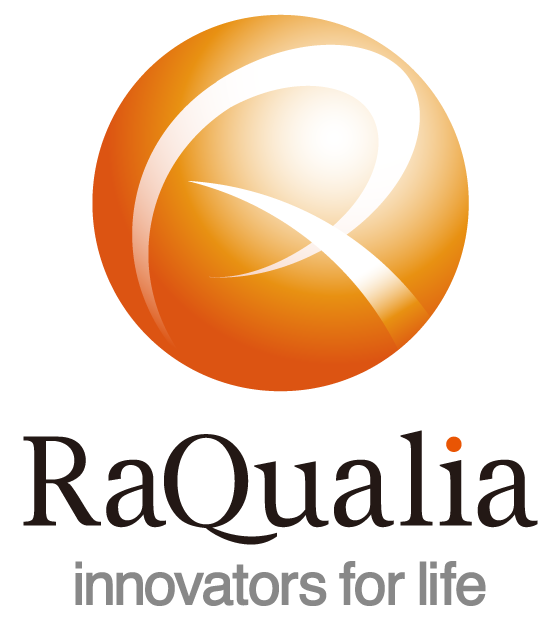
The name "RaQualia" was created by combining "Ra," a word from ancient Egypt signifying the sun deity and creative power, and "qualia," a Latin word meaning sensory perception. "Ra" expresses the warmth and passion of our employees, while "qualia" conveys how we maximize our honed senses to discover new medicines. Our corporate color is Barton Orange, which expresses our enthusiasm and energy. At the same time, its reddish hue conveys warmth and security.
RaQualia's logo is a sphere that calls to mind the sun, and on it the R and Q of RaQualia are represented in a single character. The curved element and the crossed line express collaboration and diversity. The wing at the bottom right of the R faces outward and represents our company's innovative progress and openness.